Wayfinding helps people to orientate themselves and find their way around an environment. Clear wayfinding for pedestrians supports and encourages people to walk. Wayfinding can include directional signs, information boards and surface markings.
Pedestrians need helpful visual cues and wayfinding direction to inform them of where they are and warn them of the environment ahead. Providing legible pedestrian wayfinding information is useful particularly in areas with high numbers of unfamiliar users. For example, in tourist areas and city centres it is critical to ensure routes are clearly defined and easily understood which enables people to be confident of finding their way around.
The purpose of pedestrian wayfinding is to:
- help people orientate themselves and easily find their way to their destinations with confidence
- help people to plan their journeys
- help people to create and reinforce a mental map of the area (city/town/place)
- help people to gauge travel distances and times between places
- help people to move easily between transport modes
- improve people’s experience of an area
- improve links to local businesses and attractions
- encourage more people to walk.
Wayfinding directional and geographical information can be presented in a number of ways including information plinth pillars, boards, maps, signs and surface or pavement markings. The Traffic Control Devices Rule sets out the specifications for formal directional signs that indicate the way to go, distance / time to a destination etc. Information boards, maps and posters are not considered ‘signs’ under the Rule, so there is more flexibility for local design preferences and cultural expression.
More information on wayfinding sign and information board use, and design good practice can be found in the guidance note document.
Pedestrian wayfinding signs guidance [PDF, 2.6 MB]
Clear, concise and consistent wayfinding is an essential part of helping people navigate the pedestrian network.
Key principles for wayfinding signage include:
- Universal design – this means information should be easily viewed and understood by everyone and placed conveniently out of the pedestrian through route.
- Clear and effective – wayfinding information should be high quality and engaging for people, so they are able to read, understand and react to the information displayed.
- Simple and concise – information should be sufficient only for navigation, so as to reduce sign clutter. This supports good urban form outcomes, minimises maintenance costs, and reduces obstructions. Too much information or too frequent signage is disadvantageous as it contributes to sign clutter.
- Consistent – directional and navigational information should be displayed in a consistent manner providing continuity along a route and across the network.
Directional signs should not include advertising or other commercial information. Information boards may include such information if considered relevant.
There are three main elements that can be conveyed through wayfinding. These are:
- Directional - point people to one or more destinations.
- Informational - tell people where they are in relation to their destination and / or indicating which way to go to reach that destination or alternative destinations.
- Identification - label a route or facility with logos, symbols or maps creating a brand but also reassurance that people are on the correct route.
Although many people now use smartphone applications for wayfinding, physical information boards and maps remain useful. Information boards and maps should be located where people will take the time they need to stop and absorb the information. Greater amounts of information can be provided compared with directional signs, and fonts can be smaller as it is expected a person will stop to read the information.
Information boards come in different forms with plinth pillars and landscape boards being the most common. An information board can be attached to a wall if there is no suitable location for a plinth. They generally include a map or graphic depicting the immediate area.
More information on information board types, layouts and good practice can be found in the guidance note document.
Pedestrian wayfinding signs guidance [PDF, 2.6 MB]
An information plinth pillar is an upright display panel with the following benefits:
- The larger physical area allows for more destinations and symbols.
- Information can be displayed at head height, in the ‘natural’ line of vision.
- They may be more vandal resistant than smaller signs.
- They can incorporate ‘real time’ information.
- They are easily lit.
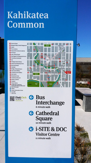
The map panel provides an ‘overhead’ view of the immediate area showing pedestrian location and possible destinations. Paper maps behind transparent protection can be updated quickly, easily and cheaply. Key destinations and landmarks can be shown graphically, helping with direction finding. Maps can be oriented according to the pedestrian’s location.

Information plinth pillar with map, Christchurch. (Photo: Glen Koorey)

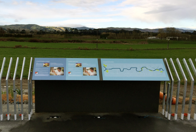
A map as part of an interpretive panel, He Ara Kotahi, Palmerston North. (Photo: John Lieswyn)
Design elements for information boards
Information boards should meet the wayfinding principles outlined above. Design elements to consider for information boards include:
-
Visibility. Information needs to be visible from a distance so that people will go to it in order to read it. The information should be mounted at the correct height and lit.
-
Legibility. The appropriate font (size and type) should be used, the font and background should offer a contrast to each other.
-
Colour. Colours should offer contrast between the information and the background. Colours should be sympathetic to the needs of those with low vision and the surroundings. Colours should be visible in low light conditions.
-
Language. Bilingual (or multi-lingual) language should be provided when appropriate. Avoid abbreviations and punctuation.
-
Graphics, symbols, pictograms etc. Recognised and approved symbols should be used. Arrows and chevrons should mirror the types used on traffic signs. Internationally recognised symbols are important for people who have difficulty reading English and people with dyslexia.
-
Font. Ideally sign design fonts should be used and minimum font sizes established. For example, the header text should be readable from approximately 10 to 15m , and other text should be readable from approximately 5m. Legend items on a map board should not have a font less than 24mm. Spacing between blocks of text should be consistent.
-
Layout. Title headings should catch the eye, maps and text should be balanced, ‘less is more’ when using text. Beware of adding extra height to the layout unintentionally.
-
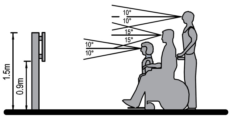
Height of information. Aim to keep most information at eye height or just above. 1.2 m- 2.0 m is a useful target (title board / heading could be higher), though recognise that wheelchair users and children are nearer a height of 0.9 m as illustrated below.
-
Materials and maintenance. The installation should be easy to maintain, the materials sustainable, a matte finish should be used to help readability, particularly for those with low vision. Anti-graffiti coatings should be considered. A regular maintenance programme is needed to ensure signs stay in good condition, free from graffiti and unobscured by vegetation, and continue to serve a purpose.
-
Placement and viewing space. The information should be next to a continuous accessible path (path through zone) but not blocking the route, path or ramps. There should be ample room to view the information should a number of people be there simultaneously and they should be able to do so without blocking other people walking past. Installing the information board in the street furniture or frontage zones of the footpath can assist with this. The immediate area should be level, even, well-lit and accessible (refer to SOS Principles ).
-
Audible and tactile information. Audible, tactile and high contrast cues can help in providing additional information to guide vision impaired people. Refer to Additional measures to guide vision impaired people section below.
More information on wayfinding information board design good practice and use can be found in the guidance note document.
Pedestrian wayfinding signs guidance [PDF, 2.6 MB]

Fields of vision for different users.
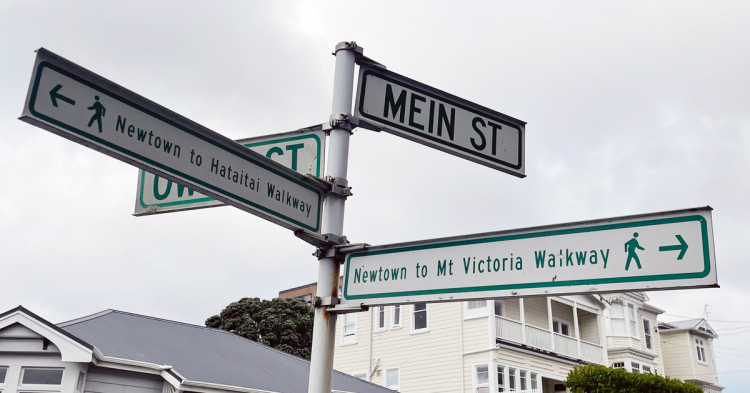
Directional signs and street name signs should be sufficiently conspicuous, legible, and meaningful that all road users (including pedestrians) can read them. Although street name signs are generally placed for drivers, they are part of the wider set of signs people walking will use to guide their way.

Pedestrian direction blade, Wellington. (Photo: James Wratt)
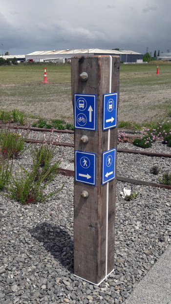
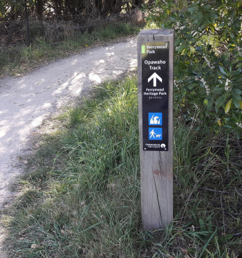
Signs can be erected on bollards or poles. Bollards are often used in parks and reserves or locations where a pole would detract from the quality of the landscape. Bollards are best used where symbols (icons) can be applied. Signs and bollards should be carefully placed so as not to be a hazard to pedestrians, refer to Street furniture guidance.
PNG: Street furniture
The example below was designed to ensure people could locate a bus stop and wider pedestrian network. The use of rustic timber was consistent with the landscape treatment.

Bollard wayfinding, Waterloo Business Park Christchurch. (Photo: Jeanette Ward)

The Traffic Control Devices Rule (TCD rule) sets out how street name signs are used, installed and specified. This includes details around colour, uses, and minimum sizes and fonts. Currently the rule does not include a set of pedestrian wayfinding signs though it does include a set of cycle wayfinding signs (nine signs numbered A51-1 to A51-9).
If the wayfinding will be for both pedestrians and people cycling, then the cycle wayfinding signs are likely to be appropriate (refer to Cycling Network Guidance - Wayfinding for more information).
If the wayfinding is for pedestrians only, then information on wayfinding sign design good practice and use can be found in the guidance note document below. This reference also covers briefly how to use the cycle wayfinding signs described above for both walking and cycling.
Cycling Network Guidance - Wayfinding
Pedestrian wayfinding signs guidance [PDF, 2.6 MB]

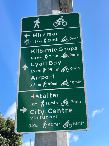
Shared walking and cycling wayfinding sign showing distance and walking/cycling times, Wellington. (Photo: James Wratt)
Design elements for directional signs
The guide to general sign design and installation is covered in the Traffic Control Devices Manual Part 1 and detailed guidance on standard directional traffic ‘guide’ signs is covered in Part 2 of the Traffic Control Devices Manual. The general design principles in Part 2 are a useful design reference.
Traffic control devices manual
Directional signs for pedestrians should meet the pedestrian wayfinding principles outlined above and good sign design principles apply. More information on wayfinding sign design good practice and use can be found in the guidance note document.
Pedestrian wayfinding signs guidance [PDF, 2.6 MB]
Directional signage should provide users with a hierarchy of destinations. Closer destinations should be signed ahead of those further away. Sign to higher priority destinations ahead of lower priority destinations and remember to limit the amount of text and destinations on the sign, especially if text is bilingual.
Only sign destinations within a walkable distance and consider including walking time.
Design elements for directional signs are similar to information boards but there will be much less information conveyed on directional signs so people do not need to stop to read the information on directional signs.
Design elements to consider for directional signs include:
-
Visibility. The sign needs to be obvious and readable from a distance.
-
Legibility. The appropriate font (size and type) should be used, the font and background should offer a contrast to each other. Sign faces are most easily read when they are perpendicular to the direction of travel. Where this is not possible, the approach angle should be within 30° of the sign face.
-
Colour. Colours should offer contrast between the information and the background. Colours should be sympathetic to the needs of those with low vision and the surroundings. Colours should be visible in low light conditions.
-
Language. Bilingual (or multi-lingual) language should be provided when appropriate. Avoid abbreviations and punctuation.
-
Graphics, symbols etc. Recognised and approved symbols should be used. Internationally recognised symbols and graphics are a universal language and are important for people who have difficulty reading English and people with dyslexia. A graphic representing the route ahead should be visible from a distance (e.g. 10 to 15m) . Arrows and chevrons should mirror the types used on traffic signs.
-
Font. Sign design fonts should be used and minimum font sizes established that can be read from at least 20m. Spacing between blocks of text should be consistent. Transport Medium font (as used on the cycle wayfinding signs A51) would be an appropriate font to use on pedestrian wayfinding signs.
-
Layout. Keep it simple, remember that the number and length of the destinations shown will govern legibility and the size of the final sign. The dimensions of the sign (i.e. height and width), a left-to-right layout, symbols, destinations, time and distance will be site specific.
-
Height of information. The mounting height will be similar to a traditional road sign and this will influence the font size etc. The sign will likely be at approximately 2.1m-3.m above ground level, sufficiently high to be seen over other street furniture and making the sign viewable from a distance. In some locations it may be appropriate for the sign to be at a lower height (e.g. eye height) as long as it does not obstruct the through route or create a hazard.
-
Materials and maintenance. Signs will typically be coated aluminium with stainless steel banding fastening them to a pole or other street furniture. Reflective materials are optional. A regular maintenance programme is needed to ensure signs stay in good condition, free from graffiti and unobscured by vegetation.
-
Placement and location. Signs should be placed outside the footpath through zone and ideally in the street furniture zone. When using the urban street layout avoid signing diagonally across the road grid but do sign across intersections where needed. Consider the overall design, size, shape and colour in the context of the streetscape, urban form and cultural outcomes.
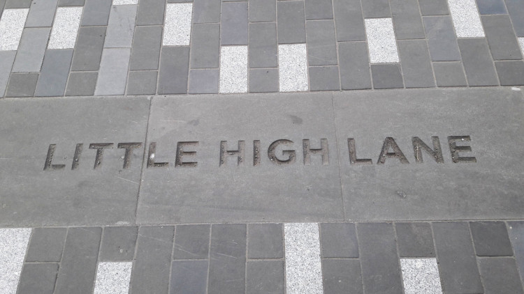
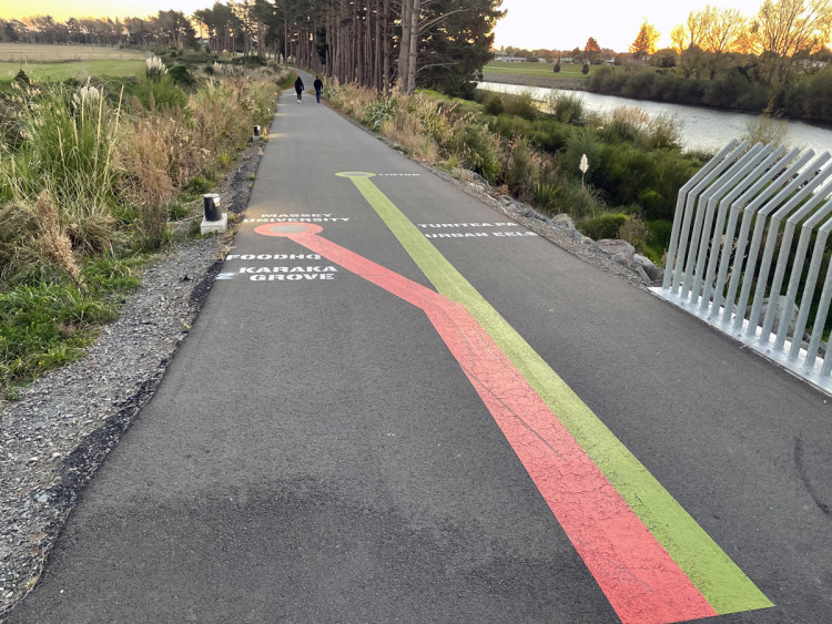
Surface or pavement markings can be used to reinforce to pedestrians and other users where they are, or they can be followed to reach a destination as illustrated below. Markings can consist of metal studs, coloured tiles, engraved pavers or painted markings set directly on the path.

Pavers that are imprinted with street name, Christchurch. (Photo: Jeanette Ward)

Wayfinding markings in a transit map style, He Ara Kotahi, Palmerston North. (Photo: James Wratt)
It is always preferable to use recognised symbols rather than words, as this makes sign faces more accessible to the vision impaired, children and those whose first language is not English.
More information on wayfinding symbols in relation to good wayfinding sign design can be found in the guidance note document.
Pedestrian wayfinding signs guidance [PDF, 2.6 MB]
For signs used by pedestrians and / or motorists there are a pre-set list of current symbols that are permitted for use. These follow internationally recognised symbols as these are set down in schedule 1 of the Traffic Control Devices Rule. These symbols are also set out on the Sign Specification page of the Traffic Control Devices Manual (Sign ID A20-S and A30-S series).
Traffic Control Devices Manual Sign Specifications
For information boards, plinths and the like, that are not signs, there is the ability to provide additional illustrations and symbology given that the information board has a different purpose. In these situations, whilst there is greater freedom there also comes greater design responsibility in ensuring clarity of message and avoiding sensory overload. Outdoor recreation symbols available in NZS 8603 may be used on information boards.
NZS 8603:2005 Design and application of outdoor recreation symbols(external link)

Example of information symbols used on signs.
Planning pedestrian wayfindingBack to top
Road controlling authorities (RCAs) should develop a process or framework for planning how they will implement wayfinding for pedestrians.
As an example, this might include:
-
Define the area.
Define the network and area to be provided with signs and information boards. How do these relate to existing signs, destination themes etc?
-
Use consistent destinations and language.
Cross reference the area to be signed to key destinations and points of interest within the area covered by the network to ensure these are covered by the wayfinding plan. Use consistent names / terminology throughout the network. Once a destination appears on a sign, it must continue to be signed at every subsequent decision point until the destination is reached. Decision points include trip origins (public transport interchanges, major carparks), destinations, locations with possible route ambiguity (including major intersections and open areas). Reinforcing signage may also be required on long routes where pedestrians may be uncertain that they have chosen the correct direction and need confirmation.
-
Choose the appropriate sign type for each decision point.
As pedestrians walk through the network they will reach natural decision points, typically where the path network has an intersection of some sort. Remember to ensure street name signs are visible. At major decision points, use both signs and information boards, which might include a map. At other decision points, use direction signs and/or street name signs. For major routes of significance consider a route logo and ‘route confirmation’ signs to reassure pedestrians they are on the right route, especially for long lengths without natural decision points.
-
Design the signs and information boards.
Space on a sign is limited. Judgement may be required as to which destination (points of interest) are included and what other symbols might be included. Recognise the standard colours and shapes of road signs and what they represent. Utilise these whenever you can and if non-standard colours are used ensure these have been tested for clarity and with those groups with visual and cognitive disorders.
-
Create sign graphics.
Incorporate approved symbols used on signs such as the cycle wayfinding signs, tourist signs and motorist service signs. This will give a clear and consistent message that is tried and tested. When route branding is utilised consider any council requirements or standard graphics already used in the area to ensure consistency. On information boards recognise the opportunities to include te reo Māori and cultural elements in the design. Some guidance on this can be found on the Te Puni Kōkiri (Ministry of Māori Development) website:
www.tpk.govt.nz(external link).
Additional measures to guide vision impaired peopleBack to top
Audible, visual and tactile cues can help in providing additional information to guide vision impaired people. These are covered in more depth in RTS 14: Guidelines for facilities for blind and vision-impaired pedestrians as described in the Designing for blind and low vision people section.
PNG: Designing for blind and low vision people
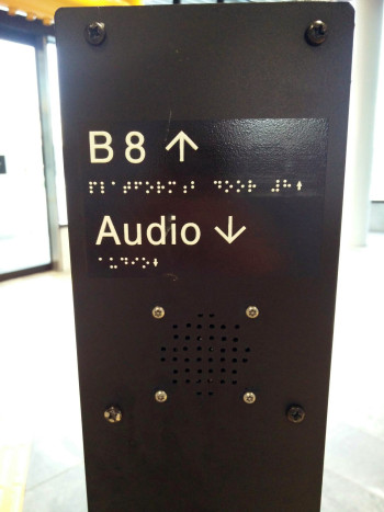
Braille is a vital language used by thousands of visually impaired people around the world including visitors to New Zealand who may be unfamiliar with our environment and wish to navigate on their own. Braille should be integrated into pedestrian wayfinding signs affixed to signal poles and at the entrance to and within public transport facilities. An example is shown below.

Braille wayfinding, Christchurch bus exchange. (Photo: Daisy Bea Scrase)
