Kerb ramps are where a localised area of the footpath is lowered to the same level as the adjacent roadway. Kerb ramps are also known as ‘kerb cut-downs’, ‘pram crossings’, 'drop kerbs' and 'dropped kerbs'.
If the kerb ramp is too steep, or there is too much of a lip between the traffic lane and the channel, I can't use it and have to go find another one. It can mean a much longer walking trip for me. |
Kerb ramps are an integral part of most crossings. The alternative is a blended kerb where the footpath and roadway meet at the same level which are usually found at pedestrian platforms, raised zebra crossings, kerbless streets or shared spaces.
When designing kerb ramps, it is important to ensure that:
Every kerb ramp comprises:
The general form of a kerb ramp is illustrated below.
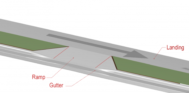
Typical perpendicular kerb ramp.
The use of parallel and combination ramps may be appropriate when the path is also used by cyclists or high volumes of people using wheeled mobility devices however they are generally less comfortable for pedestrians as they require people on the through route to change levels.
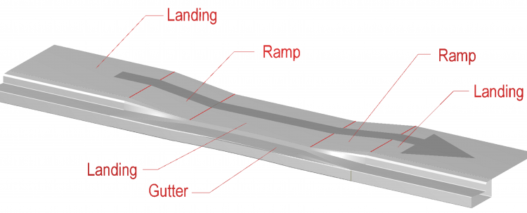
Parallel kerb ramp.
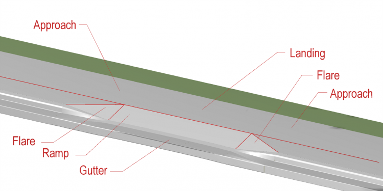
Combination kerb ramp.
The Horizontal geometric design for mobility scooters technical note provides guidance on the radius or chamfer required to accommodate the turning envelope of a mobility scooter travelling between a kerb ramp and path.
Waka Kotahi technical advice note #21-06: Horizontal geometric design for mobility scooters
Pedestrians, especially those with mobility impairments, pushing a heavy buggy or wheelchair, or carrying luggage are likely to experience difficulty in negotiating steep kerb ramps (gradients of 1:8) noting these gradients are relative to the horizontal and not the surrounding surface. In hillside areas it may not be possible to achieve these requirements, however due consideration needs to be given to the accessibility needs of all pedestrians. Many people pushing small wheels find it difficult to change direction while on the ramp. This means curved kerbs require kerb ramps with bottom landings as seen in the illustration below.
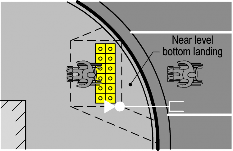
Correct bottom landing arrangement.
Kerb ramps can be problematic for some people with impaired vision because they often use the kerb face as a tactile cue for the footpath edge and kerb ramps can increase the risk of inadvertently walking out into the roadway. To avoid this, all kerb ramps should incorporate appropriate tactile indicators. Warning tactile indicators should be arranged so that it is not possible to inadvertently bypass them and enter the roadway.
Warning tactile indicators shall be installed a minimum of 600mm deep and the full width of the kerb ramp, but need not cover the entire face of the kerb ramp.
Where it is desirable for users who are blind or have low vision, to detect that they are entering the kerb ramp from the side, flares with an abrupt change of grade steeper than 12.5% but no steeper than 17% are appropriate. This will be particularly appropriate where users entering from this direction could inadvertently enter the roadway by bypassing the warning tactile indicators. In most situations it will be desirable for the entry across the flare at the top of the ramp to be more gentle than near the kerb.
The figure below shows a typical kerb ramp design.
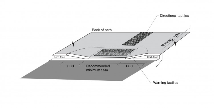
Typical kerb ramp design.
Table: Design elements of kerb ramps
Kerb ramps should comply with the general dimensions outlined in the table below.
|
Element |
Key issues |
Additional information |
|
Ramp |
Desired gradient is 5% where there is space. Normal maximum gradient 8% Maximum gradient 12% |
A gradient of 10% should only be considered for constrained situations where the vertical rise is less than 150mm. A gradient of 12% should only be considered for constrained situations where the vertical rise is less than 75mm. Slopes more than 12% are very difficult for people pushing small wheels to negotiate. To avoid using these steeper gradients, lower the footpath as shown in the parallel ramp diagram |
|
Maximum crossfall 2% |
Should be consistent across the whole ramp – avoid twist. |
|
|
Minimum width of 1.5m |
Wider ramps may be necessary for higher pedestrian volumes. |
|
|
Maximum width: equal to the width of the approaching footpath |
Wider ramps are difficult for people with vision impairment to detect. |
|
|
Gutter |
Maximum gradient 5% |
Anything greater can cause some people to lose their balance at the transition. |
|
Transition between gutter and ramp |
Should be smooth with no vertical face. Ensure that this does not inadvertently happen when the roadway has been resurfaced. 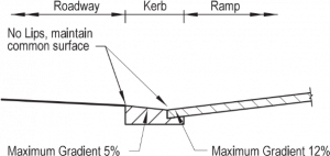
Typical gutter design |
|
|
Landing |
Maximum gradient 2% |
To prevent people pushing small wheels overbalancing, or accidentally rolling, and to provide a rest area. |
|
Maximum crossfall 2% |
||
|
Width: equal to that of the ramp |
||
|
Minimum depth 1.2m (top landing) |
A depth of 1.5m is preferred. |
|
|
Flare |
Maximum gradient 16% |
Use the steeper value if a vision impaired person could inadvertently enter and leave the kerb ramp from the side and bypass the tactile indicators. |
|
Maximum gradient: as per the ramp section |
Use these gentler values if mobility impaired people are expected to enter and leave the kerb ramp from the side due to the top platform being too small. For a kerb ramp perpendicular to a straight kerb this results in a splay angle of 45o. |
|
|
Tactile indicators |
All kerb ramps should incorporate appropriate tactile ground surface indicators. |
Warning indicators shall be provided on all kerb ramps. Directional indicators are likely to be required unless the crossing point is on the continuous accessible path of travel. For installation requirements, refer to: |